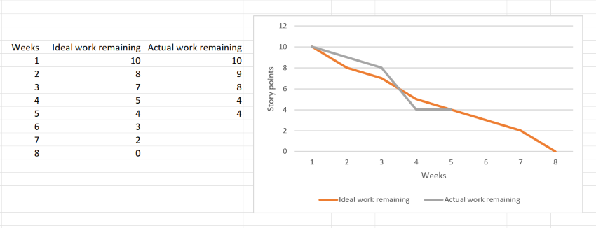
A Burndown Chart is a graphical representation of the amount of work remaining for a project and the time it will take to complete it. Burndown charts are frequently used in software development, particularly in teams using Agile project management.

Y axis - how work remaining can be measured
Different projects will use different measurements to determine work remaining. For example, you could use:- the number of features or user stories remaining to be complete
- number of story points remaining
- the amount of time required to complete those features or user stories
- the number of open bugs remaining to be fixed
How do you create a burndown chart?
There are a few different ways to create a burndown chart, but a common method is to use a spreadsheet program like Microsoft Excel.To create a burndown chart in Excel:
- Set up your data in three columns,
- with the first column listing the days or weeks of the project timeline,
- the second column showing the ideal work rate and
- the third showing the amount of work remaining for each day or week.
- Select the columns of data and insert a line chart.
- Format the chart as desired, such as adding a title, legend, and gridlines.
- Save the chart and share it with your team.

How is a burndown chart used?
Burndown charts are most commonly used to track progress on Agile software development projects. In agile methodology, work is broken down into small pieces called "sprints." A sprint typically lasts two to four weeks.At the beginning of a sprint, the team sets a goal for the amount of work they want to complete. The burndown chart is used to track progress towards this goal.
The burndown chart can help the team identify if they are ahead or behind schedule and make adjustments accordingly.
What are the benefits of using a burndown chart?
- Helps teams see progress and identify trends
- Encourages transparency and communication
- Facilitates agile project management
- Can be used for multiple projects
What are some limitations of burndown charts?
While burndown charts offer many benefits, there are also some limitations to keep in mind, such as:- They only show progress over time, not the quality of work
- They assume all tasks/user stories as equal in size and complexity
- They do not account for unexpected events or setbacks
- They can be too simplistic for complex projects
Get a Burndown Chart Template
Get a professional Burndown Chart Template
See all project management words
Methodology specific dictionaries / glossaries
- View the Agile Dictionary
- Managing Successful Programmes (MSP) Dictionary
- Prince 2 glossary of terms
- Full ITIL glossary of terms
- See also Risk Management Dictionary.

